Books
I have designed books in all genres but my favorite
is fiction. With fiction you can push the envelope
and juxtapose an image with typography in such a
way that encourages a connection with the
reader who wants to discover more.
̌

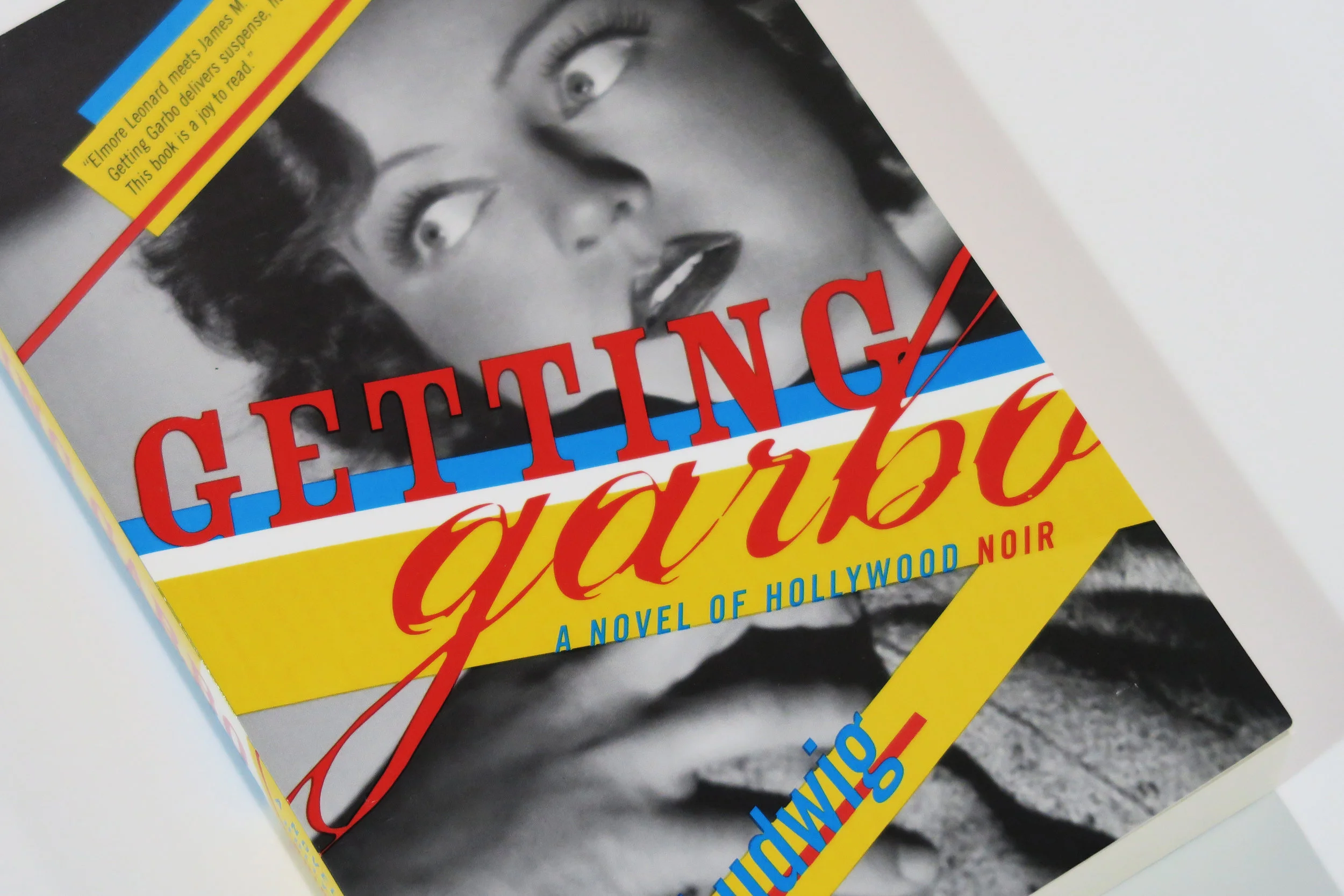
fiction - modern take on film noir

fiction - intriguing juxtaposition of images to reference the plot bring in the viewer
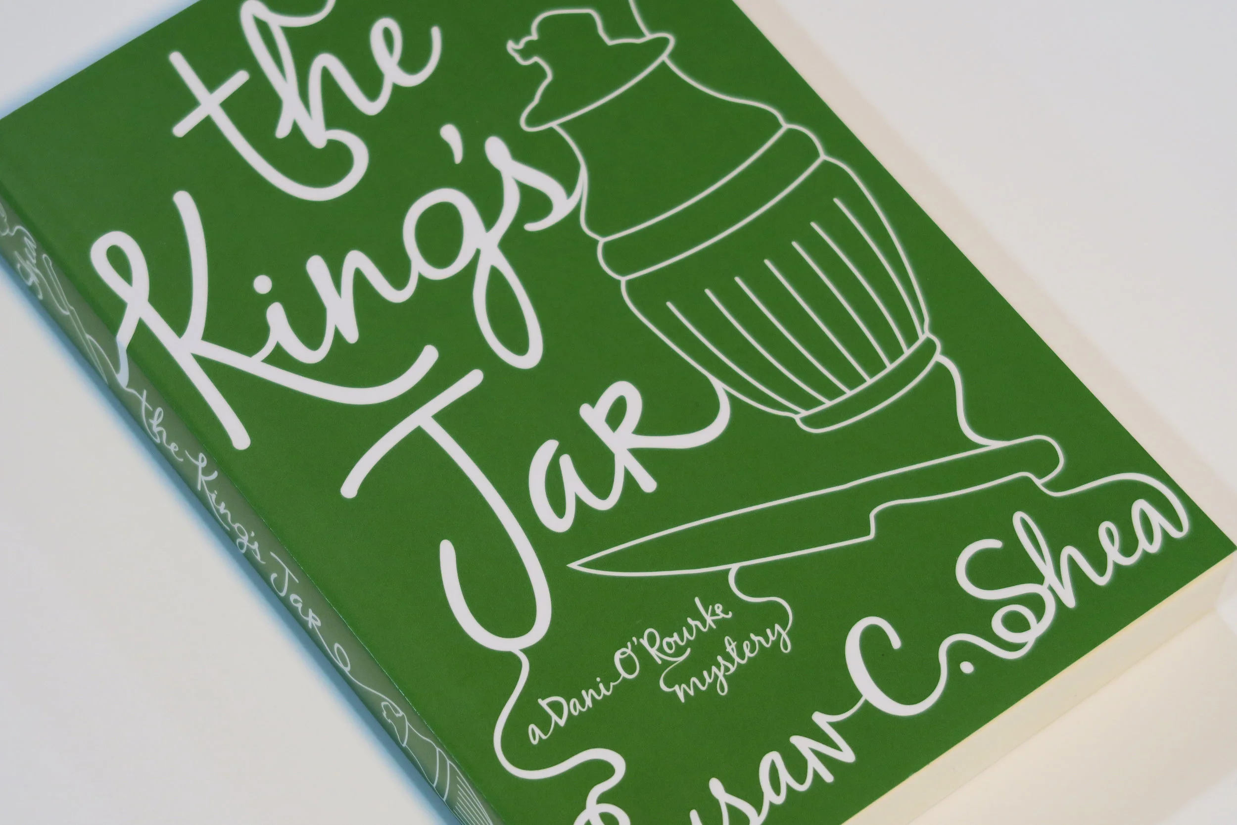
fiction - hand illustrated / metallic ink printing
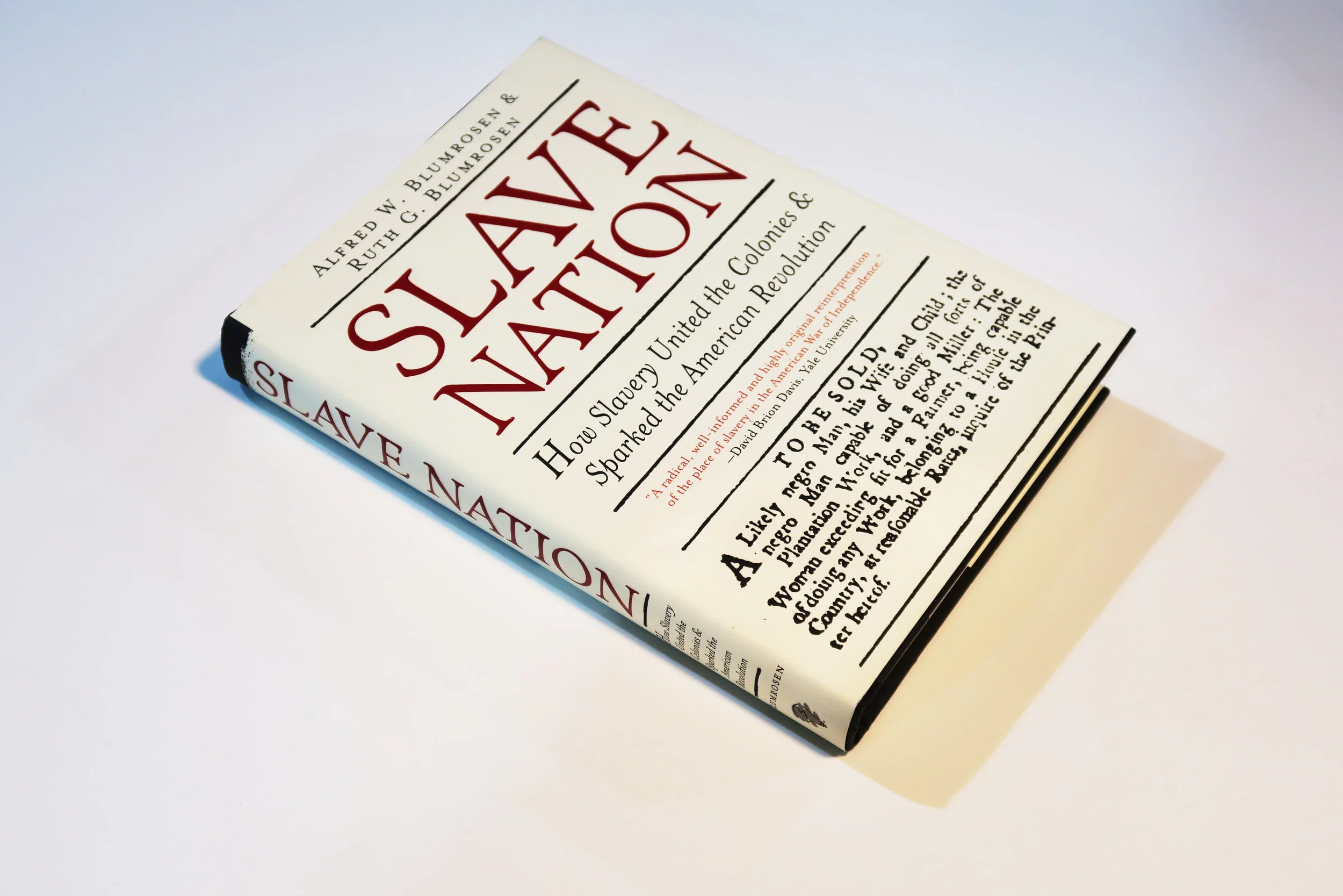
non-fiction - utilized uncoated paper, debossing on all type, and red matte foil stamp instead of printed color to mimic a letterpress slave auction poster of the time. The jacket was strengthened by a coating applied to the underside of the paper for durability.
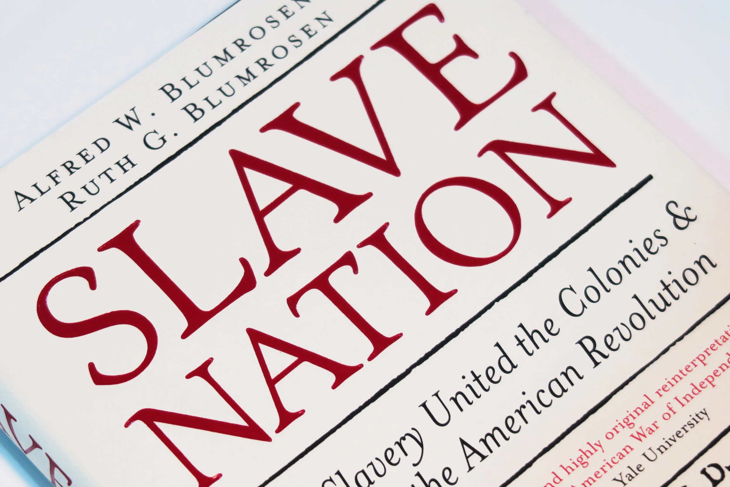
close-up to show detail
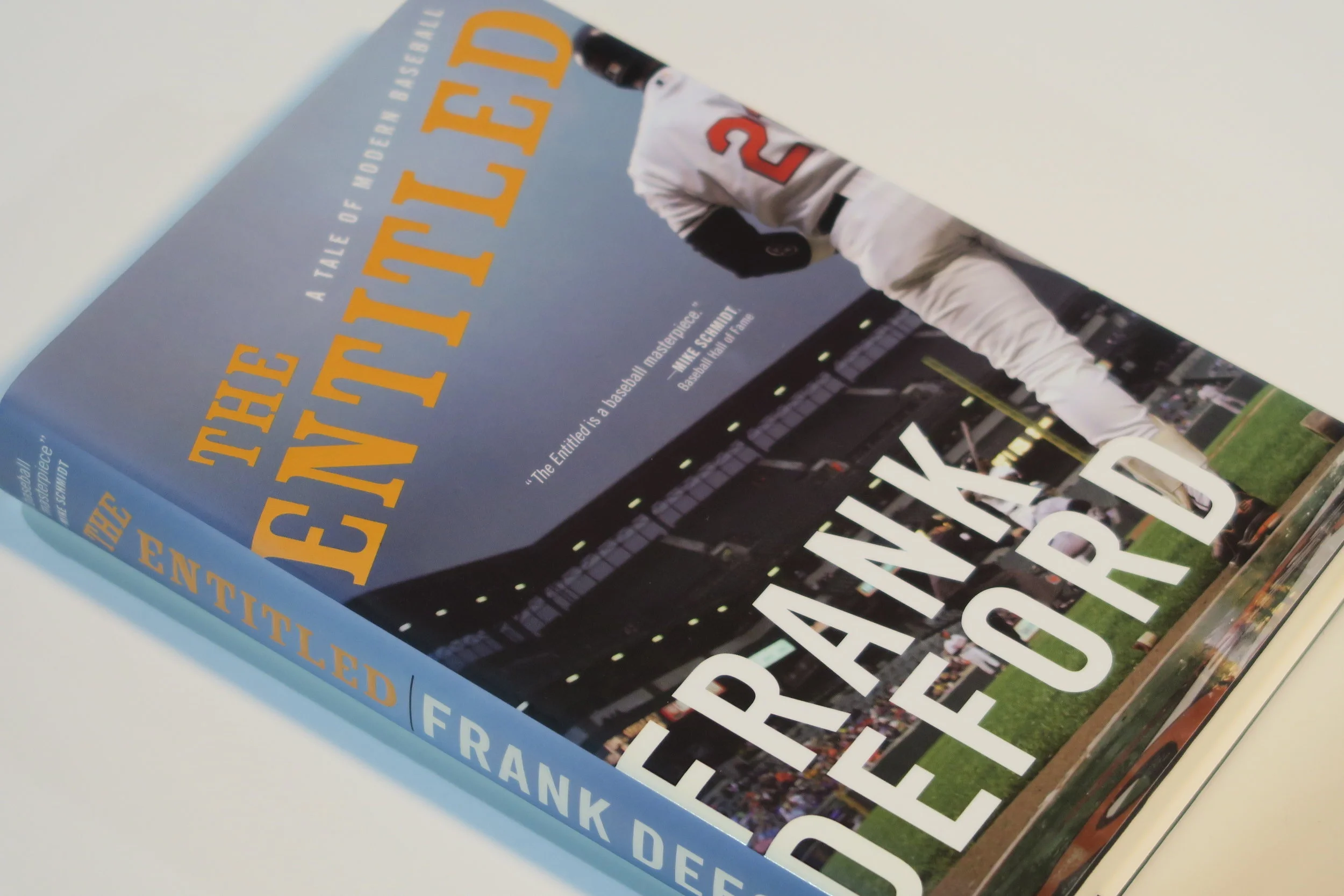
fiction - oversized author name to feature famous sports author, along with embossing on title and matte with spot-uv treatment to pop the title and give the cover a comforting feeling.
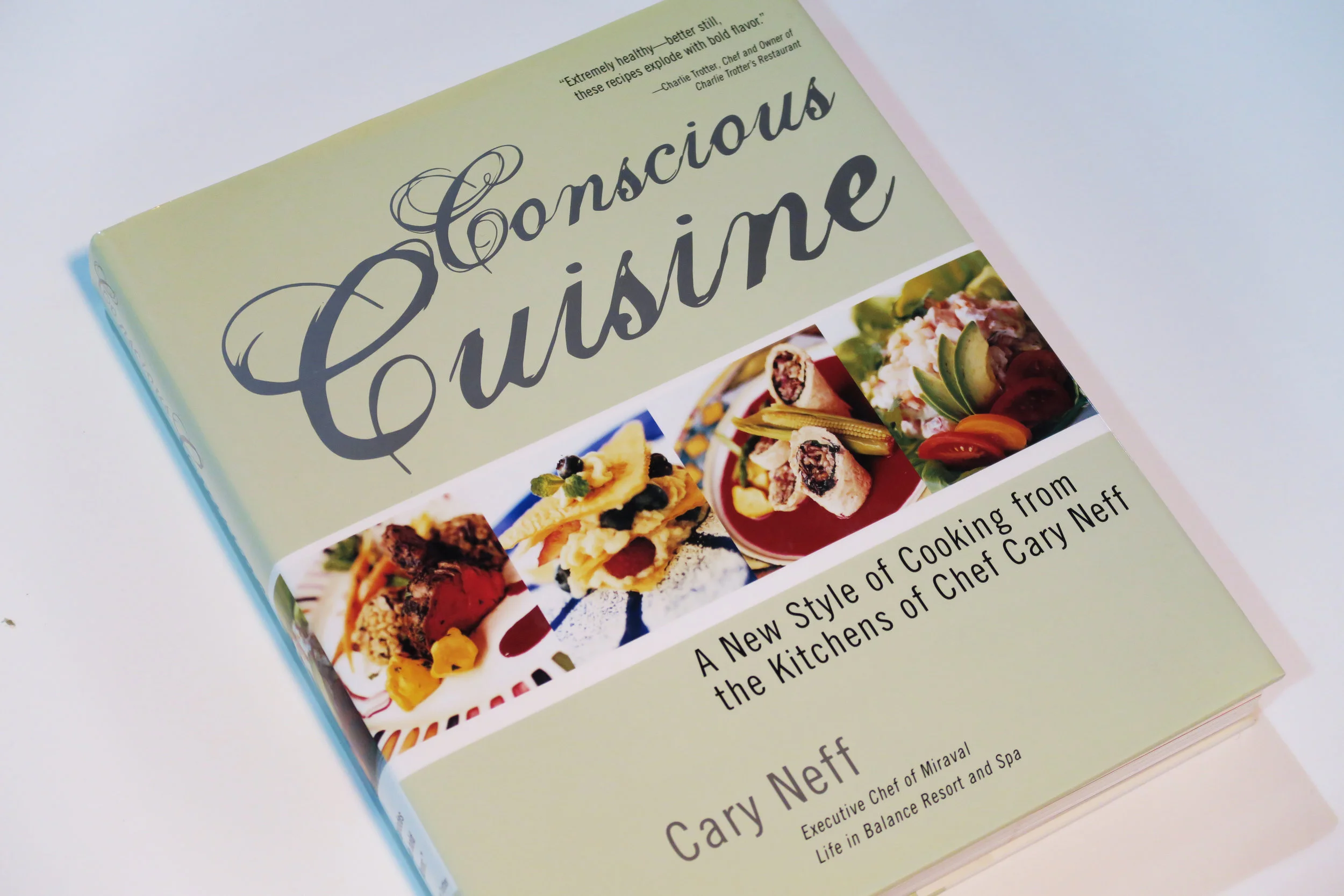
cookbook - high end food photography combined with simulated hand-lettered font to make spa chef Cary Neff’s “new” technique of eating accessible.
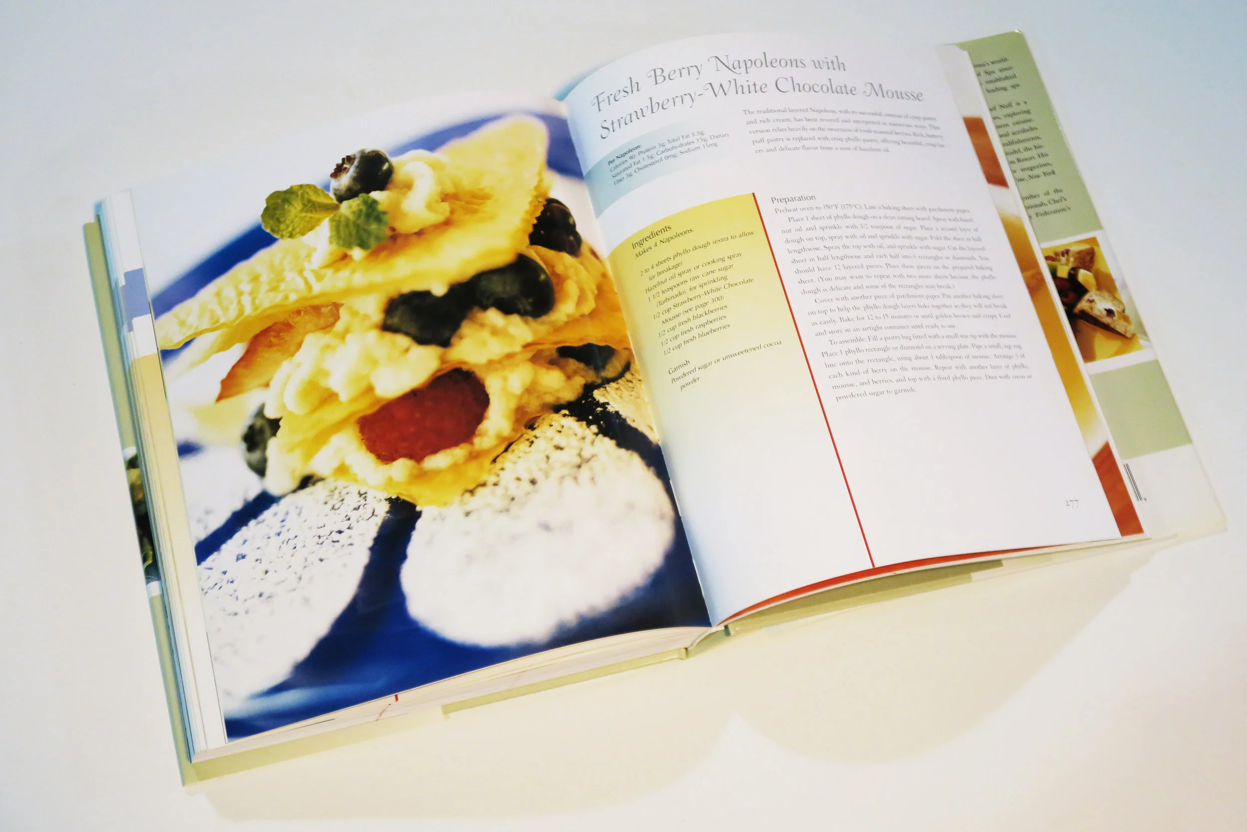
internal spread for conscious cuisine, every recipe included nutrition estimates an well and ingredients and instructions
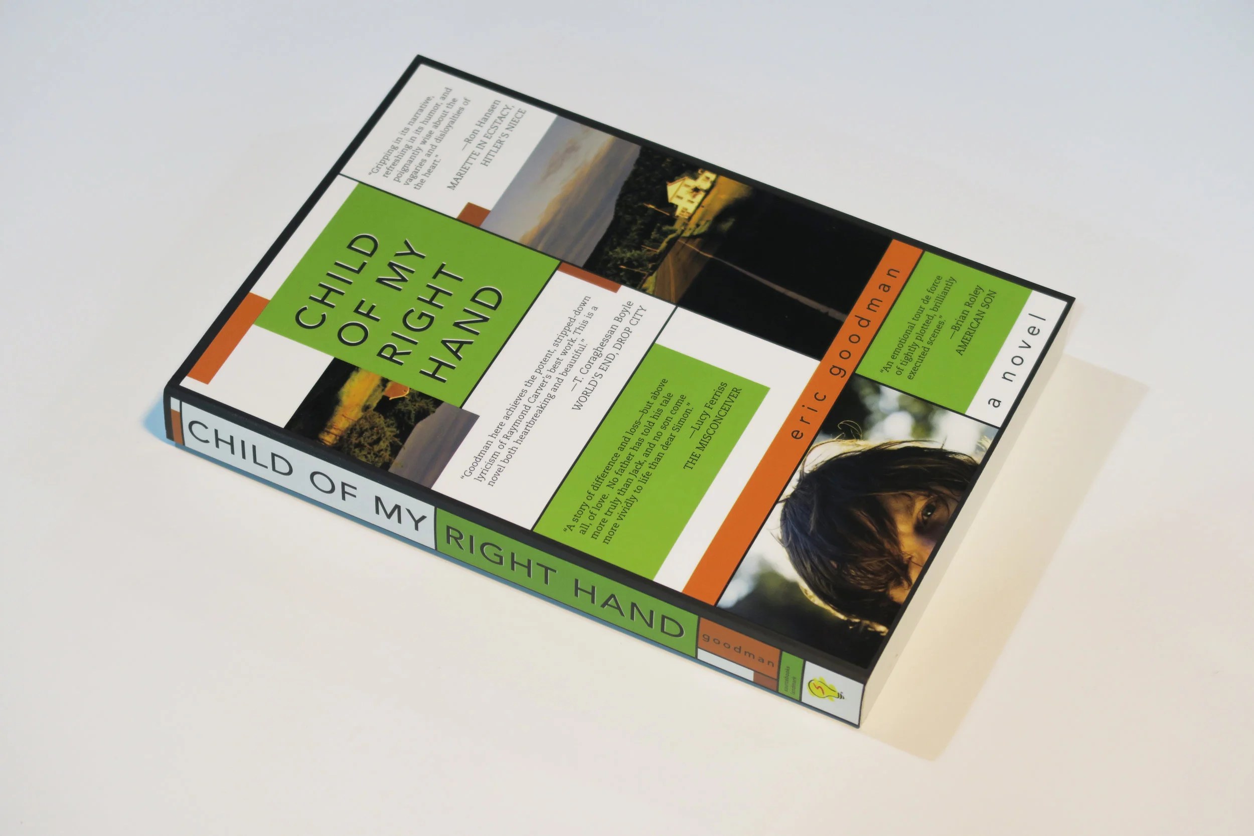
fiction - this cover featured more text and quotes than most so I used a blocking technique on the cover to accommodate it and also reflect the way the story is told.
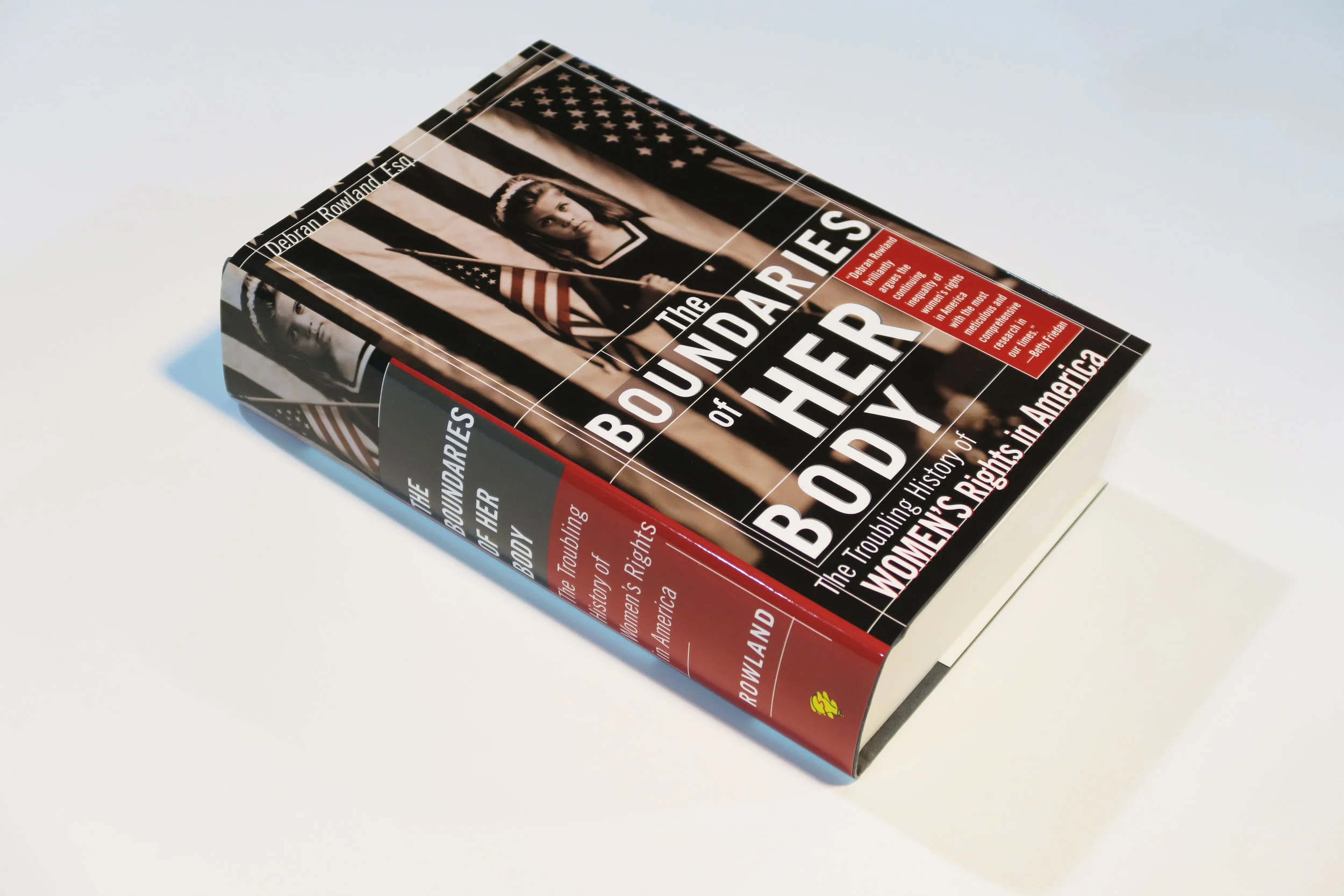
non-fiction - cover photo represents the early age in which women and their bodies are affected by the government, by only colorizing the flag she is holding draws the eye to the girl first. the title constrained within a framework further supports the boundaries in which women themselves are constrained but the use of all caps shows the power that women have.
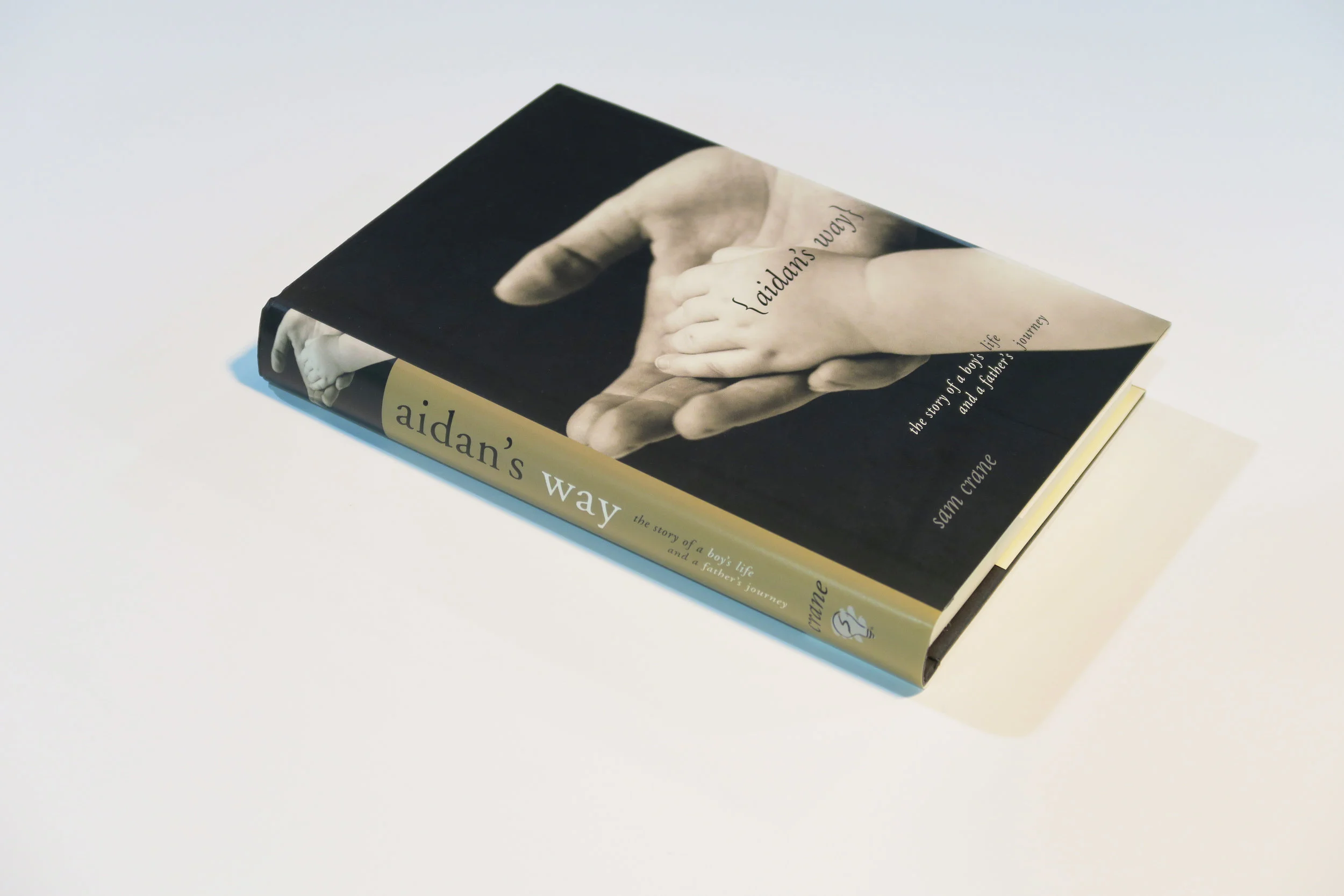
memoir - a touching story of a father’s love for his disabled son. I made very deliberate choice about the cover typography and how it also “laid” on the image in the same the hands lay one one another.
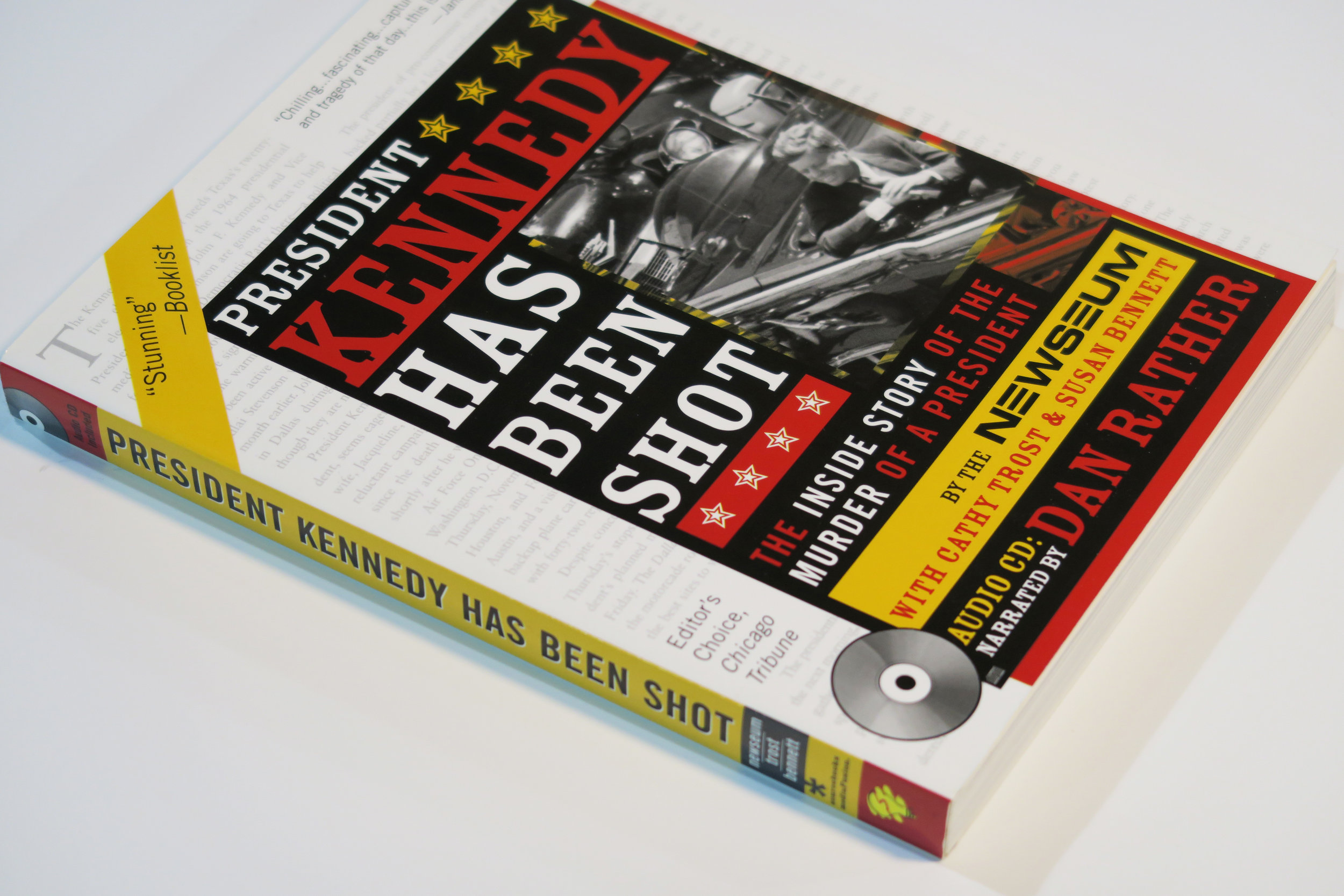
non-fiction with audio component - utilized a combination of newspaper and the wood type letterpress poster style from the time to show the historic nature of the book. The book itself is a chronological account of the day President Kennedy was shot and actual audio from new and other outlets that accompany and highlight the text to give you a more in-depth experience.
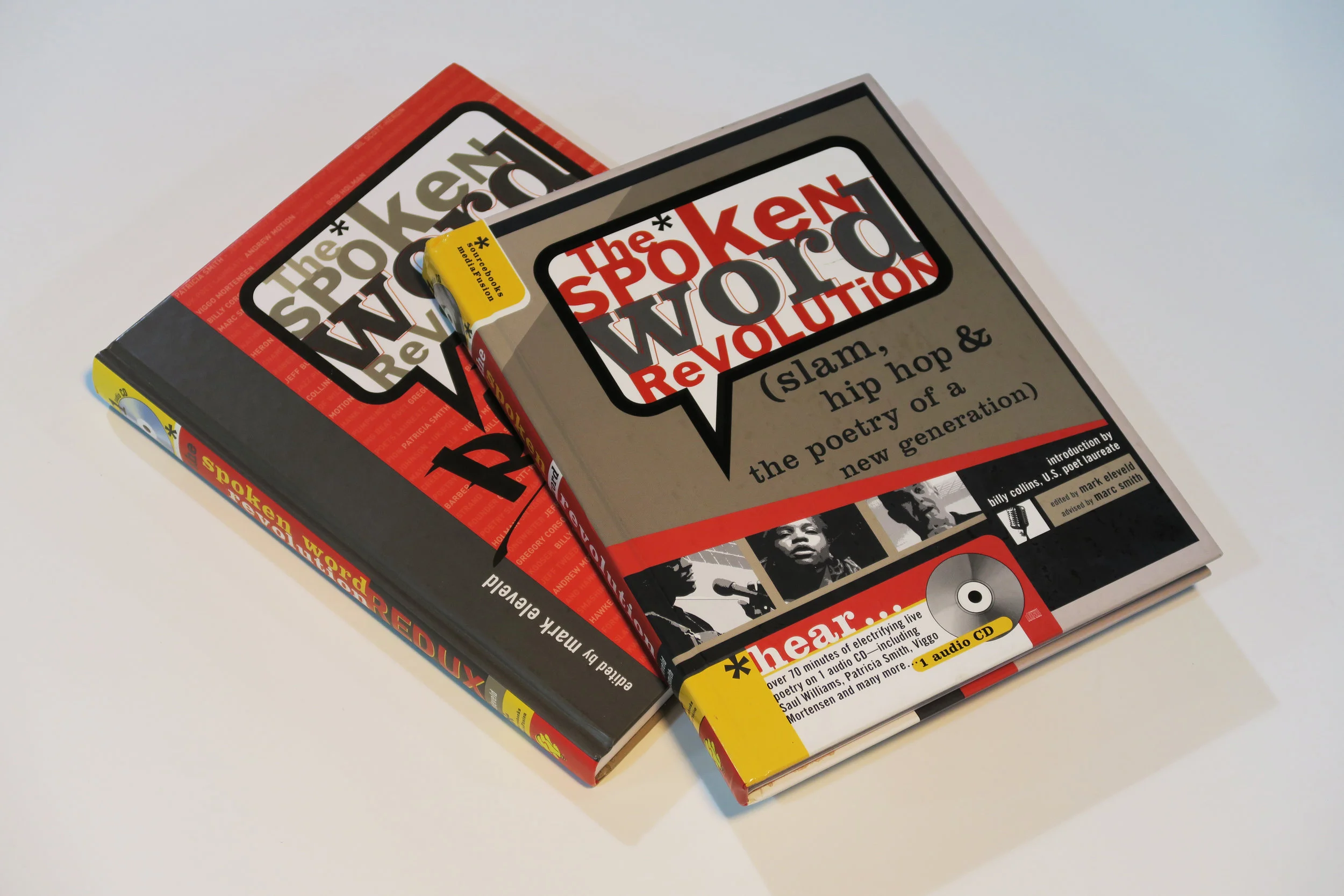
poetry - these books bring the experience of the spoken word poetry tradition to life when is was a budding style in Chicago. The founders of this poetry style wanted you to not only read the poetry but hear it in its true form. The cover and internal typographical treatment reflects not only the culture but the realness and rawness of the poems themselves. The consistent use of talk bubbles were used to remind the reader, visually, of the “spoken” essence of this style of poetry.
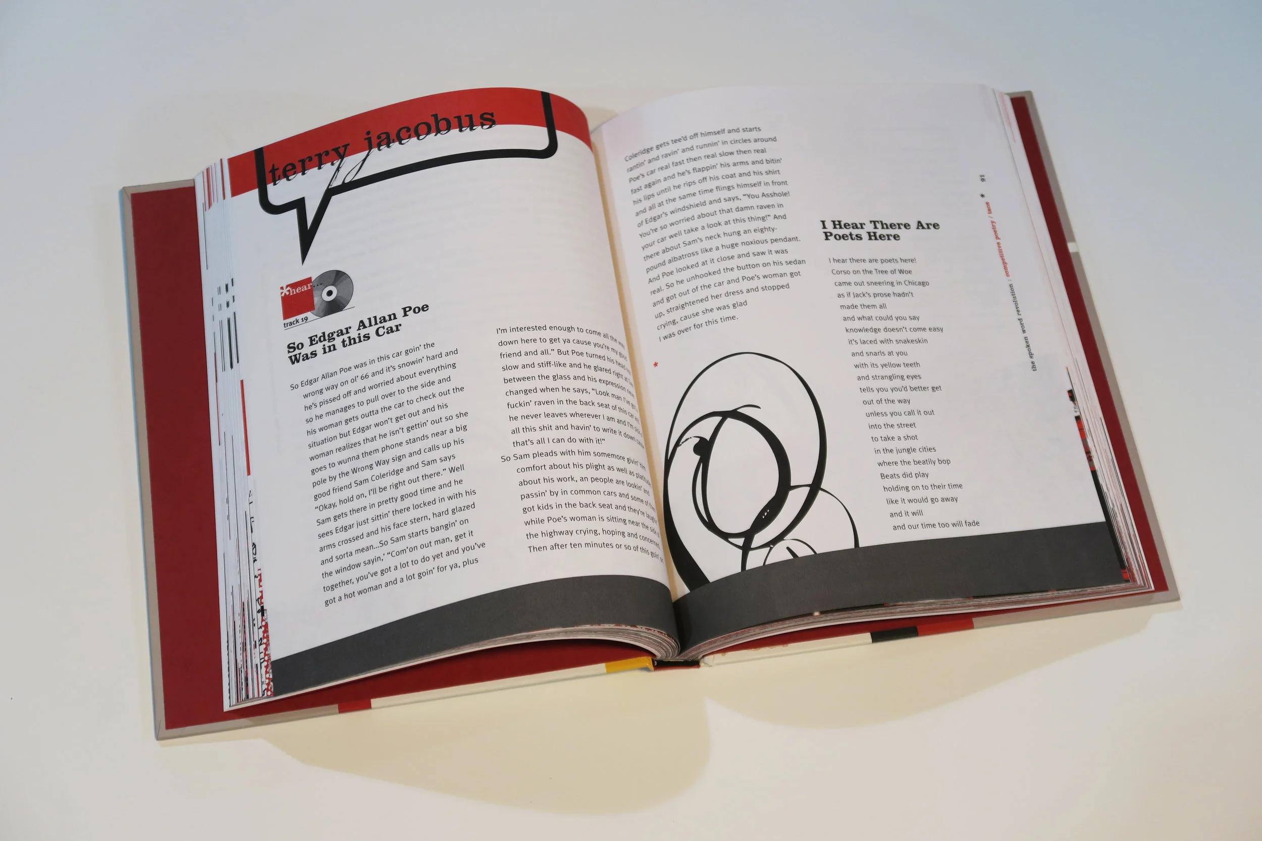
internal spread example

self-help series - create a series look for books that are easy to understand and high-level information about different topics. Using the brown bag effect, the red band, and the series logo, it will be to adapt to any new topic that might be covered.

fiction - a modern take on a classic concept by featuring a photograph of a bride underwater and type that is bold and a mix of sizes.


